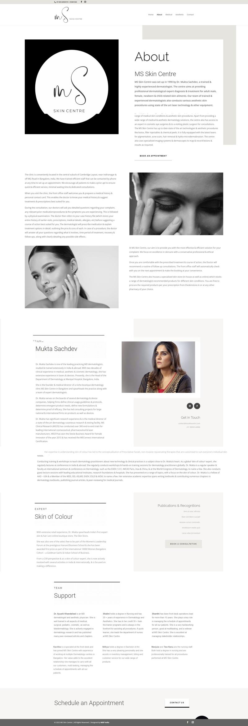
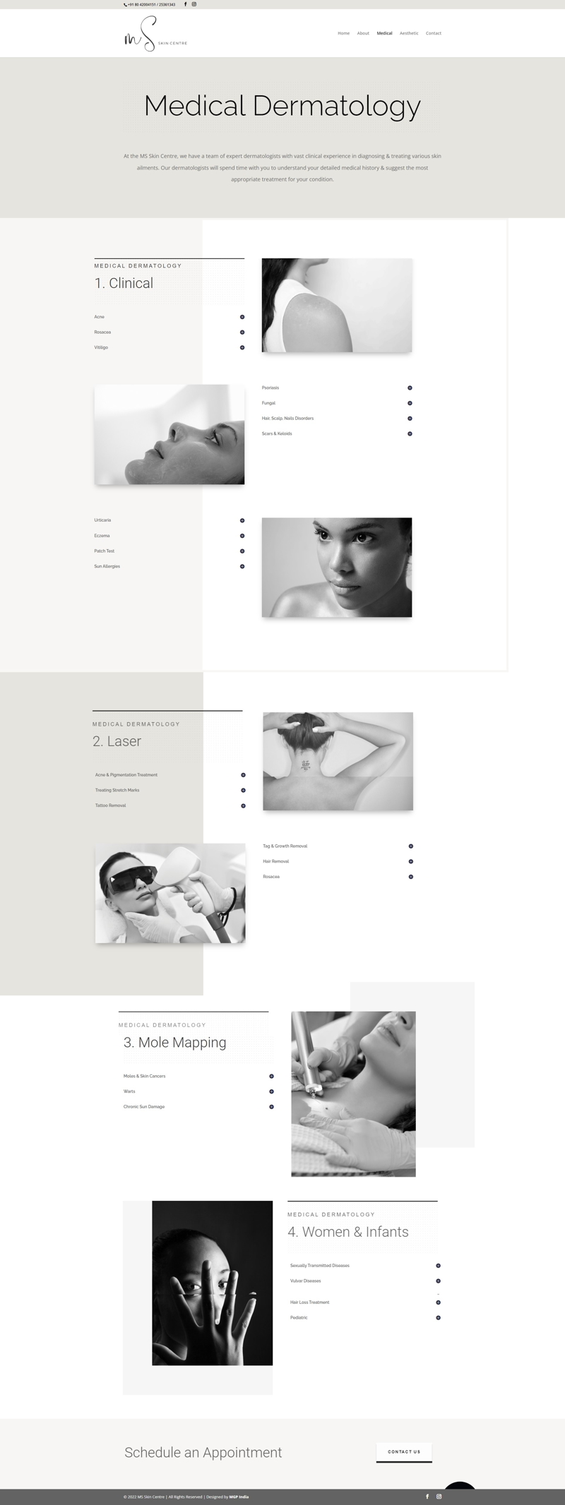
MS Skin Centre
healthcare
Backstory
Just like Mukta paints her clinic once a year, she likes to redo her logo and website at the same frequency. Some days she likes bright and pink, other days it is metallic. Recently it was black and white with a touch of red.
We have had many discussions on redoing the branding, changing the colours, often stemming from a bad reproduction on a white ceramic gift mug, but thankfully, good sense has prevailed. I have always wanted to infuse the personality of the owner into their brand, but in this case, I am afraid, the brand can’t keep up with its owner’s eclectic personality.
The touch of red will have to wait.
Post Edit…
She painted once again!

“
Very meticulous, extremely punctual and understands our not so well defined design requirements. She is sincere, straight up and one of the most efficient design professionals for whom I have deep respect and trust in managing my communication across several verticals. She is simply the best!
2014 – Present


