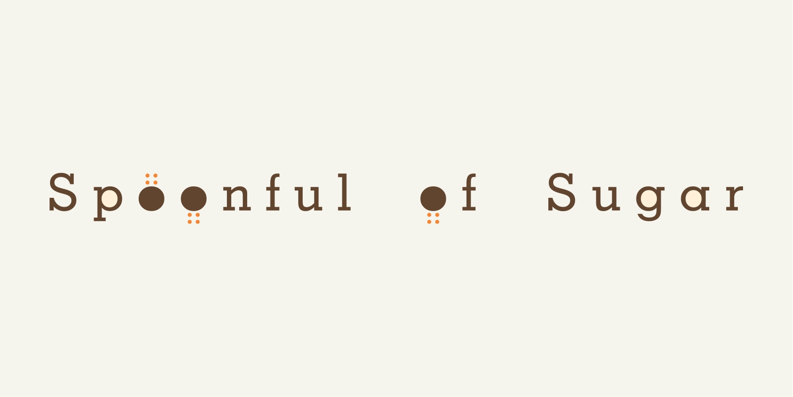
Spoonful of Sugar
Patisserie
Logo Design
Story
Casual Cafe and Cake Shop. Desserts.
Backstory
Without a doubt, Sangeeta is an international level confectioner. I was first introduced to her via her delicious dark chocolate indulgence topped with fresh kiwis and strawberries. How she remained slim while baking such exquisite delights was always a wonder.
Sangeeta was looking at starting a shop, tired of working in a makeshift kitchen from her husband’s office.
My girls were small then, Barney had made way for Julie Andrews and the girls had graduated to watching respectable films like the Sound of Music and Mary Poppins.
When I presented the brand name – Spoonful of Sugar, Sangeeta did not jump with joy. She said she would confer with her daughter Yuvna who was studying in the UK and get back. She got back the next day saying Yuvna jumped with joy and the name was approved.
I wanted to give the logo a Baking and Caking feel and the sprinkling of sugar dots on the brown tops was a last minute, rather satisfactory addition. But we went back and forth on the colours. Chocolate brown was my obvious choice and Sangeeta wanted colour options. After a lot of iterations, I chose to hand over the designs like I deemed them fit, refusing to budge on my graphic and colour convictions, and being young, heady and arrogant at that time, I told her to take it or leave it. She took it and left.
A few years later she opened a big fancy store in Koramangala, with my given name, but another design. 3 different fonts used in the branding, purple and blue colours. BLUE!!
The shop closed down permanently on 31 March 2019 in sync with the financial year ending. There is hope that I may lose some weight now.
2005
