Willow TV
sports
Logo Design
Story
Cricket broacasting
Backstory
S and V didn’t realise they were my clients until one day I redesigned their company logo. They were a 2 man army, lived incognito (hence S and V), and ran their million-dollar business from the Red Rock coffee shop in Mountain View. They had a development and production house in Bangalore with a lean team. Their brand – Willow TV, broadcasted cricket to millions of desis in America. S had made the logo in MS Word using the Ariel font. Sometime later the font changed to Times New Roman. A local friend booed the logo and redesigned it changing the font to Garamond. The job didn’t come to me. I invaded it.
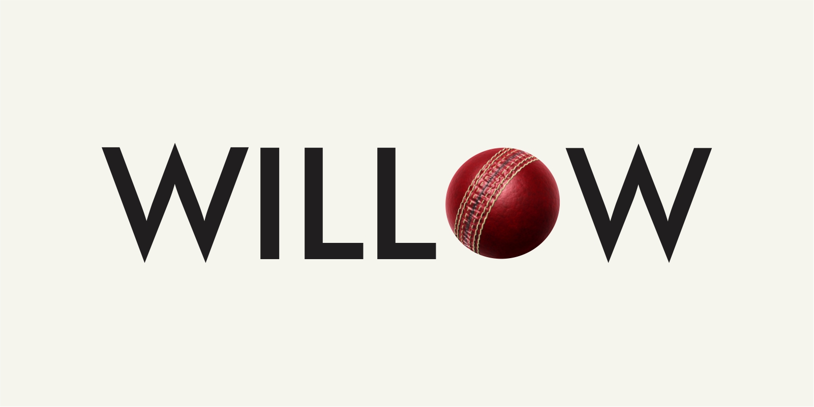
I replaced the O in Willow with a cricket ball, making it relevant to the industry that it represented. The concept was approved in a minute. I thought it was over and out. And then S asked for some font options. After 33 iterations, they selected the first font I had used – Futura. I handed it over and forgot about it.
A few years later, Willow TV got bought over by Times Internet. The logo has over 4 million views. Just saying!
Edit – August of 2023, the logo have changed. Oh well!
2007 – 2023
